

Hello there! I am Shivam,
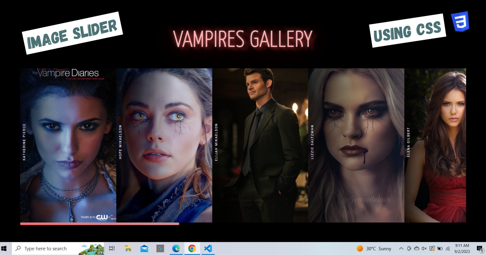
Today I'm going to show you how to create an interactive image slider for your website. A well-styled image slider can enhance the visual experience for your users and engagingly showcase your best photos.
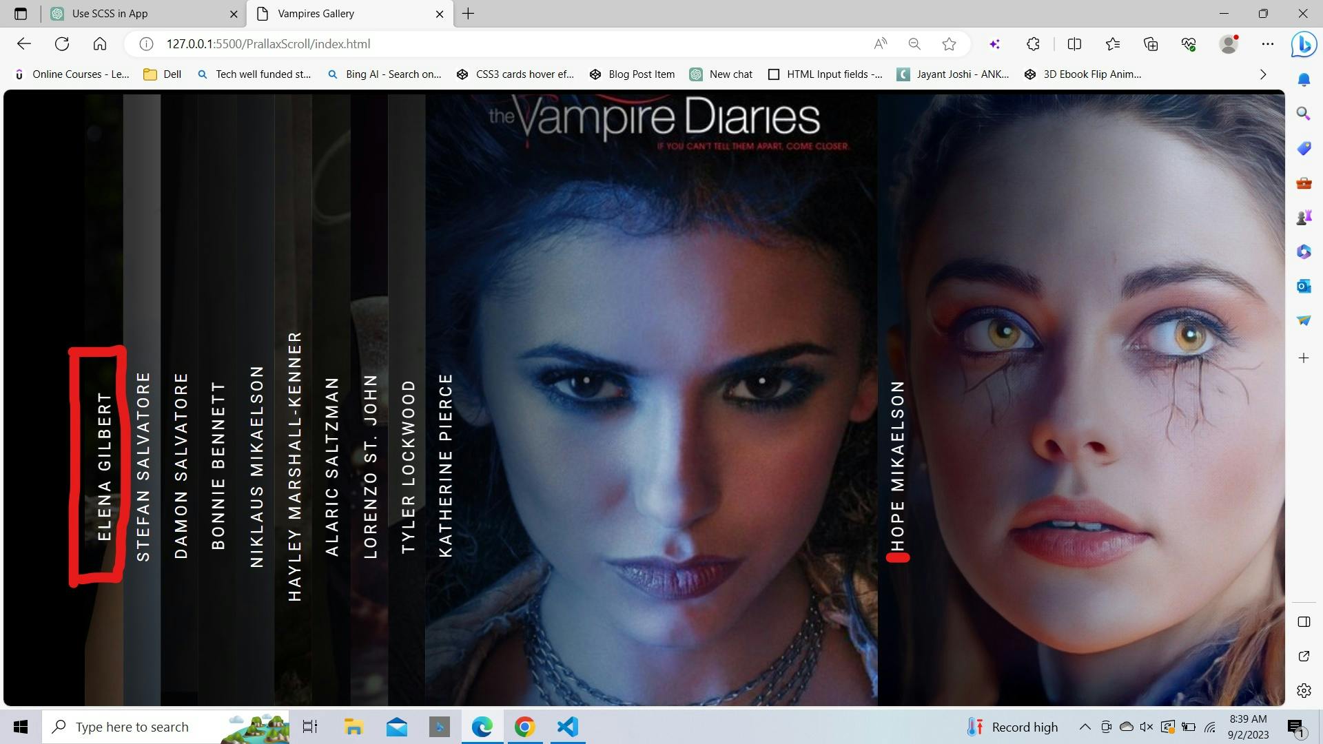
It will also show captions for each image. A caption is a text that describes the image.
.gif?updatedAt=1693626964818)
We will use HTML and CSS to build this slider. We will learn some CSS techniques:
Pseudo-elements: We add special HTML elements created with CSS.
Absolute positioning: We precisely place elements on the screen.
CSS animations: We make the image changes smooth.
To create this effect, Here's what you'll need to get started:
You should know:
Basic HTML to add the image slider container and images
Essential CSS to style and position the slider
You'll need:
A text editor like VS Code, or Sublime Text to write the HTML and CSS code
A web browser like Chrome, Firefox, or Edge to preview your work
That's all you need! Now let's build this image slider together step-by-step:
Setting Up the HTML
We'll begin by creating the HTML structure for our Vampires Gallery. We'll define the gallery title, image list, and corresponding descriptions here.
  <!DOCTYPE html>
  <html>
    <head>
      <!-- metadata and stylesheets here -->
    </head>
    <body>
      <h2>Vampire Gallery</h2>
      <ul id="vampire-gallery">
        <!-- images and names go here -->
      </ul>
    </body>
  </html>
The <!DOCTYPE html> declares this is an HTML5 document.
The <head> contains metadata like the charset and viewport, plus stylesheets.
The <body> holds the content:
An
<h2>with the titleA
<ul>with ID "vampire-gallery" to hold our list of items
Each list item will have:
An
<img>with:srcpointing to the image URLaltwith an accessibility description
A
<span>containing the vampire's name
Example:
  <li>
    <img src="elena.jpg" alt="Elena Gilbert">
    <span>Elena Gilbert</span>
  </li>
We'll repeat this <li> for each vampire, changing the:
img srcimg altspantext
Example:
<!DOCTYPE html>
<html lang="en">
<head>
    <meta charset="UTF-8">
    <meta name="viewport" content="width=device-width, initial-scale=1.0">
    <link href='https://fonts.googleapis.com/css?family=Yanone+Kaffeesatz:200' rel='stylesheet' type='text/css'>
    <link rel="stylesheet" href="style.css">
    <title>Vampires Gallery</title>
</head>

<body>
    <h2>Vampires Gallery</h2>
    <ul id="vampire-gallery">
        <li> <img src="https://wallpaperaccess.com/full/4693090.jpg" alt="Elena" /><span>Elena
                Gilbert</span></li>
        <li> <img
                src="https://vignette.wikia.nocookie.net/the-vampire-diariesoriginals-fanfiction/images/f/fe/Stefan-Salvatore-The-Vampire-Diaries.jpg/revision/latest?cb=20151020020437"
                alt="Stefan Salvatore" /><span>Stefan Salvatore</span></li>
        <li> <img src="https://wallpapercave.com/dwp1x/wp2897388.jpg" alt="Damon" /><span>Damon
                Salvatore</span></li>
        <li> <img src="https://wallpapercave.com/dwp1x/wp4632590.jpg" alt="Bonnie" /><span>Bonnie
                Bennett</span></li>
        <li> <img src="https://wallpapers.com/images/high/klaus-mikaelson-with-gray-background-0q12vf9w53irvlgp.webp"
                alt="Klaus" /><span>Niklaus Mikaelson</span></li>
   </ul>
</body>
</html>
Crafting the CSS
Now, let's dive into the CSS. This is where the magic happens. We'll create stunning animations and styles for our gallery.
First, we import the Roboto font from Google Fonts[You can pick your choice]:
@import url("https://fonts.googleapis.com/css?family=Roboto:400,400i,700");
Then we reset all margins, and paddings and use border-box sizing:
  *,
  *::before,
  *::after {
    margin: 0;
    padding: 0;
    box-sizing: border-box;
  }
For the <body> we:
Set the font family to
RobotoUse a
blackbackgroundMake the text
uppercaseIncrease
letter spacingDecrease
font sizeSet the text color to
white
body {
  min-height: 100vh;
  font-family: "Roboto", sans-serif;
  background: black;
  text-transform: uppercase;
  letter-spacing: 0.2em;
  font-size: 0.9rem;
  color: #fff;
  display: grid;
  grid-template-columns: 1fr;
  grid-template-rows: 0.1fr 1fr;
  grid-column-gap: 0px;
  grid-row-gap: 0px;
  align-items: center;
  justify-items: center;
}
For the <h2> we:
Increase
font sizeDecrease
font-weightApply an animation to create a flickering effect
h2 {
  margin-top: 5rem;
}

h2 a {
  font-size: 4.5rem;
  animation: lights 5s 750ms linear infinite;
  font-family: Yanone Kaffeesatz, sans-serif;
  text-decoration: none;
}
@keyframes lights: This defines a keyframe animation named "lights" with various animation states (0%, 30%, 40%, 70%, and 100%). It animates the color and text shadow of the <h2> element to create a flickering effect.
@keyframes lights {
  0% {
    color: hsl(0, 39%, 80%);
    text-shadow:
      0 0 1em hsla(0, 100%, 50%, 0.2),
      0 0 0.125em hsla(0, 100%, 60%, 0.3),
      -1em -0.125em 0.5em hsla(0, 100%, 60%, 0),
      1em 0.125em 0.5em hsla(0, 100%, 60%, 0);
  }

  30% {
    color: hsl(0, 80%, 90%);
    text-shadow:
      0 0 1em hsla(0, 100%, 50%, 0.5),
      0 0 0.125em hsla(0, 100%, 60%, 0.5),
      -0.5em -0.125em 0.25em hsla(0, 100%, 60%, 0.2),
      0.5em 0.125em 0.25em hsla(0, 100%, 60%, 0.4);
  }

  40% {
    color: hsl(0, 100%, 85%);
    text-shadow:
      0 0 1em hsla(0, 100%, 50%, 0.5),
      0 0 0.125em hsla(0, 100%, 90%, 0.5),
      -0.25em -0.125em 0.125em hsla(0, 100%, 60%, 0.2),
      0.25em 0.125em 0.125em hsla(0, 100%, 60%, 0.4);
  }

  70% {
    color: hsl(0, 80%, 90%);
    text-shadow:
      0 0 1em hsla(0, 100%, 50%, 0.5),
      0 0 0.125em hsla(0, 100%, 60%, 0.5),
      0.5em -0.125em 0.25em hsla(0, 100%, 60%, 0.2),
      -0.5em 0.125em 0.25em hsla(0, 100%, 60%, 0.4);
  }

  100% {
    color: hsl(0, 39%, 80%);
    text-shadow:
      0 0 1em hsla(0, 100%, 50%, 0.2),
      0 0 0.125em hsla(0, 100%, 60%, 0.3),
      1em -0.125em 0.5em hsla(0, 100%, 60%, 0),
      -1em 0.125em 0.5em hsla(0, 100%, 60%, 0);
  }
}
Style Unordered List Elements:
Now, we will style an unordered list element.👇
ul {
  list-style: none;
  width: min(100vw, 70rem);
  max-width: 70rem;
  display: flex;
  overflow-y: hidden;
  padding-bottom: 2rem;
}
Here,
list-style: none;removes the default list of bullet points.width: min(100vw, 70rem);sets the width of the list to the minimum value between 100 viewport width units (vw) and 70remunits. This ensures that the list won't exceed 70remin width but can shrink to fit the screen if it's narrower.max-width: 70rem;sets a maximum width of 70remfor the list.display: flex;makes the list items (which are typicallylielements) behave as flex items.overflow-y: hidden;hides the vertical scrollbar if the content overflows vertically.padding-bottom: 2rem;adds some padding to the bottom of the list, providing spacing below the list items.
Customizing Scrollbar
#vampire-gallery::-webkit-scrollbar {
  width: 12px;
  height: 7px;
}
This 👆styles the scrollbar within the element that has the ID "style-2". By setting the width and height, we control the size of the scrollbar.
#vampire-gallery::-webkit-scrollbar-thumb {
  border-radius: 10px;
  -webkit-box-shadow: inset 0px -3px 6px rgb(0 0 0 / 0%);
  background-image: linear-gradient(to right top, #ff5d5d, #f2706f, #e28180, #d1908f, #bc9d9d);
}
This 👆 styles the thumb (draggable part) of the scrollbar. Giving it rounded corners and a box shadow makes it appear raised from the track. The gradient background gives it a colorful appearance.
Style List Items
Now let's style the list items (typically images and captions)
li styles the list items. 👇
li {
  flex: 0 0 45vw;
  max-width: 17rem;
  position: sticky;
  top: 0;
  left: 0;
  display: flex;
  justify-content: center;
  align-items: flex-start;
  height: 23rem;
}
The flex properties set an initial width while constraining the maximum width. Positioning the items as "sticky" makes them stick to the top of the container when scrolling. The absolute positioning aligns them to the top left. Being flex containers allows us to center their content both vertically and horizontally. The fixed height constrains their size.
Style Captions
Now we'll use li span to style the captions inside list items.
li span {
  position: absolute;
  top: 0;
  left: 0;
  display: block;
  padding: 0.75em;
  height: 100%;
  writing-mode: vertical-lr;
  text-align: center;
  transform: rotate(180deg);
}
This styles the captions within the list of items. Positioning them absolutely within the list item aligns them properly. The full height, vertical text writing mode, and 180-degree rotation create vertically oriented captions. Padding and centered text complete the style.
We'll use li::before to style a pseudo-element that creates a gradient overlay over the images in the list of items.

li::before {
  content: "";
  position: absolute;
  top: 55%;
  left: 0%;
  transform: translate(0%, -50%);
  height: 110%;
  width: 100%;
  background-image: linear-gradient(to right, rgb(0 0 0 / 80%) 2%, transparent 60%);
  z-index: -1;
}
Here, content: ""; generates an empty content box for the pseudo-element.
position: absolute;positions the pseudo-element absolutely within its list item.top: 55%;vertically centers the pseudo-element within its list item.left: 0%;aligns the pseudo-element to the left edge of its list item.transform: translate(0%, -50%);further adjusts the positioning to center the pseudo-element vertically.height: 110%;extends the height of the pseudo-element to cover 110% of its list item's height.width: 100%;sets the width of the pseudo-element to 100% of its list item.background-image: linear-gradient(to right, rgb(0 0 0 / 80%) 2%, transparent 60%);defines a gradient background for the pseudo-element, creating a fading effect from the left side.z-index: -1;positions the pseudo-element behind its list item content.
Style List Images
Now let's style the images within the list of items.
li img {
  display: block;
  height: 27rem;
  width: 100%;
  -o-object-fit: cover;
  object-fit: cover;
  position: absolute;
  top: 50%;
  left: 0;
  transform: translate(0%, -50%);
  z-index: -2;
}
It styles the images within the list of items. Being block elements allows them to fill their containers. Absolute positioning and transform centering vertically align them properly within the list item. The fixed height constrains their size. The lower z-index positions them behind the overlay and content. The object-fit property ensures the images maintain their aspect ratio while filling their containers.
Wrapping Up
And with that, we've built a fully functional horizontal image slider with HTML and CSS! I hope this tutorial has given you a good introduction to some CSS concepts like:
• Pseudo elements - We used the ::before pseudo element to add the overlay gradient on hover.
• Absolute positioning - We positioned the image and caption within the slide div to center and overlay them.
• CSS transitions - The smooth fade transition on hover was achieved using the CSS transition property.
Thanks for reading it. I hope it was insightful. All the source code used in this article is in my GitHub repository.
If you liked the article, please post likes 👍, give it a ⭐, and share it in your circles.
Let's connect. I share content related to web development, technical writing, and Open Source.👇
Thanks for reading 😊